Non-text Contrast
Form field borders, icons and control edges are at least 3:1 against what surrounds them.
Who it affects
If a shopper with low vision can't see the edge of the email field or the cart icon, they can't find it to use it.
What a scan checks
- Text fields, selects and checkboxes whose border is their only edge, measured against the nearest painted background.
- Buttons and links that show only an icon, measured where the icon is most visible.
How it gets fixed
- The border or icon gets the nearest shade of its own color that reaches 3:1, from SiteRemora's stylesheet in your theme. Your theme keeps its focus and error colors.
Every change is shown before it is applied, recorded with the code it replaced, and reverts in one click.
Before and after, on real stores
Found by our scanner on live Shopify stores and fixed in a test browser with the same change the app makes. The stores are described rather than named, and their names are taken out of the code.
A newsletter field you can barely see
A woodturning supply catalog on Expanse
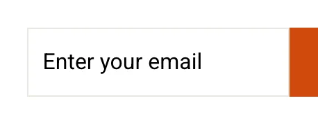
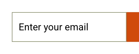
The border was #e8e8e1 on white, 1.23:1. It now uses the nearest shade of that same gray that reaches 3:1, from SiteRemora's stylesheet, and the theme keeps its focus and error colors.
Attach a remora to your shop
Install from the App Store. The first scan is free, takes about a minute, and tells you exactly where you stand.